By now you will have noticed that I am in no way a photographer to manipulate my pictures to no end. Yet sometimes, a shot can be made dramatically better with a few adjustments. Most of them are in Lightroom, a few more tricky ones are done in Photoshop. By no means is this a do-all-end-all workflow, but it may show you some tricks to improve your own shots with minimal effort. There are plenty of Youtube videos out there that show you people skilled in their trade pass brushes and menus at light speed, leaving you in awe of what they’re capable of. That is exactly what they want. They don’t want you to learn, just to show off what they can do. So let’s do this step by step so you can follow on one of your own pictures. Make sure you have LrC and PS handy, both come in the Photographer’s Subscription from Adobe.
I’ll do this with screenshots of complete screens, no off-screen manipulation.
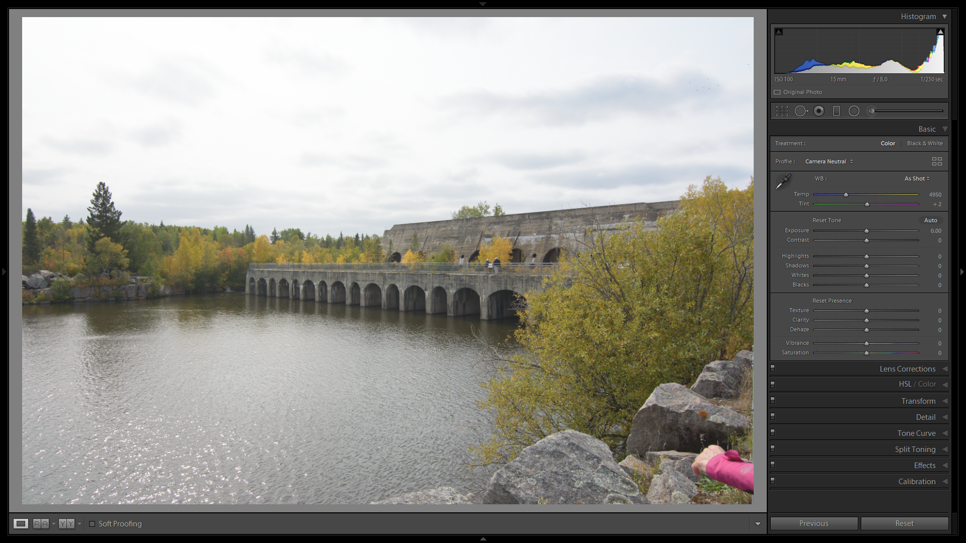 The picture I chose (at random, mostly) is this RAW picture of the Pinawa Dam in Manitoba. I shoot in RAW, never in JPG.The basic profile I apply upon import is Camera Neutral. This usually gives me the broadest way to improve my shots and the most details available from the RAW file out of the camera. It also gives a pretty bland representation of the subject.
Let’s start with a crop. The pink jacket at the bottom right has no reason to be there.
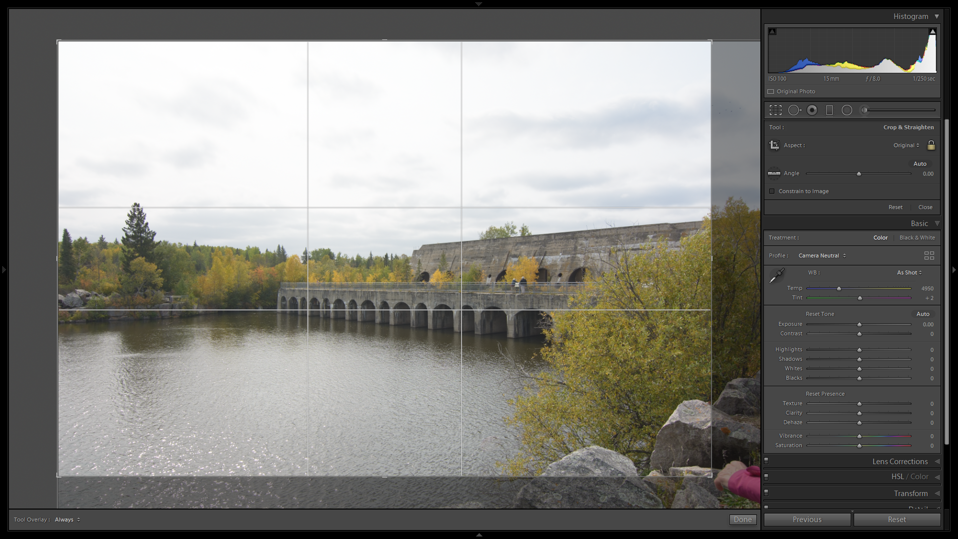
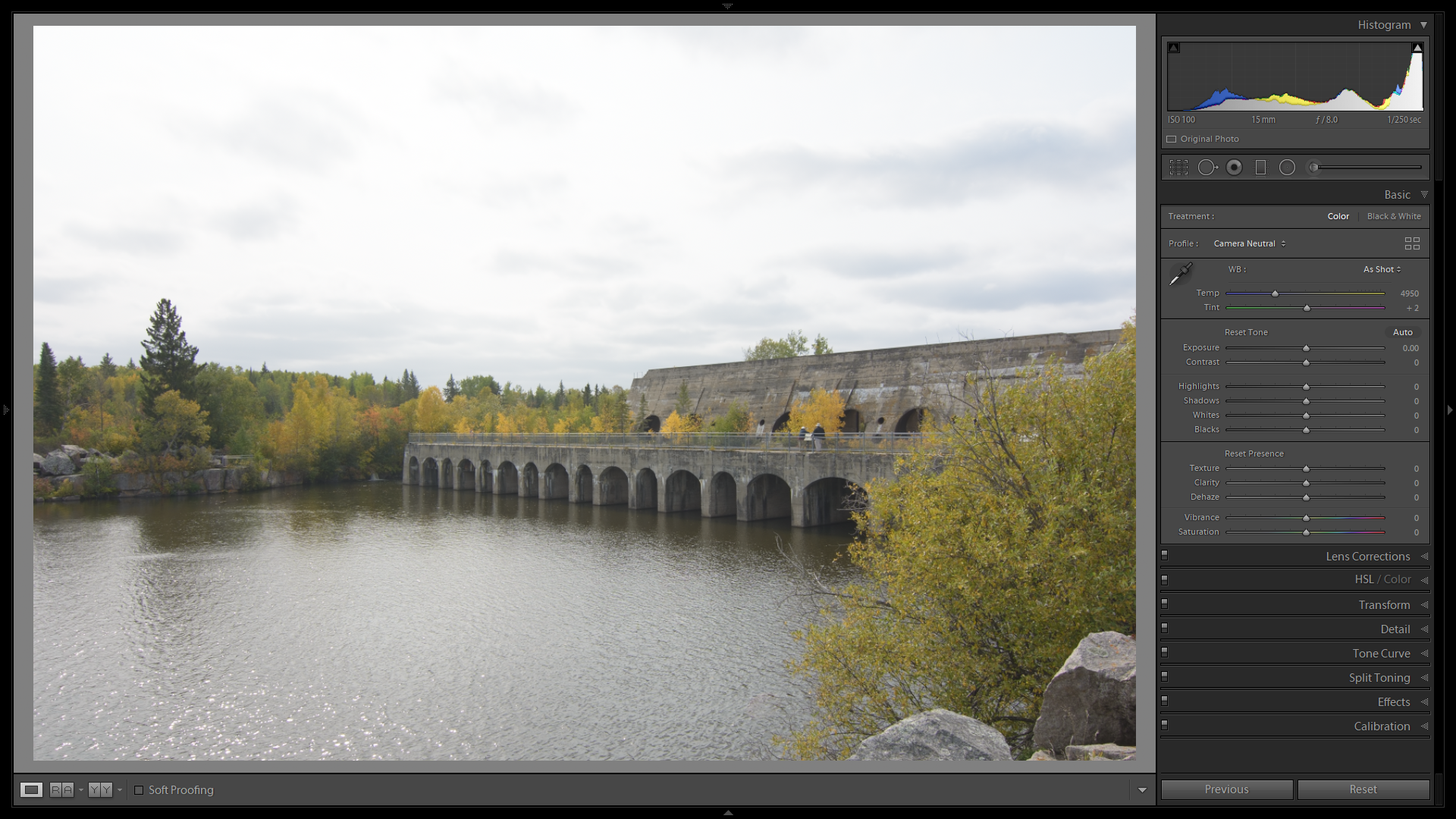
Why start with cropping? Well, the “Auto” settings are based on what is remaining in view, not what is in the original picture. Cropping out a specific colour or a very bright object will influence the behaviour of those tools. Click “Done” in the bottom toolbar or simply double-click in the cropped area to apply the crop.
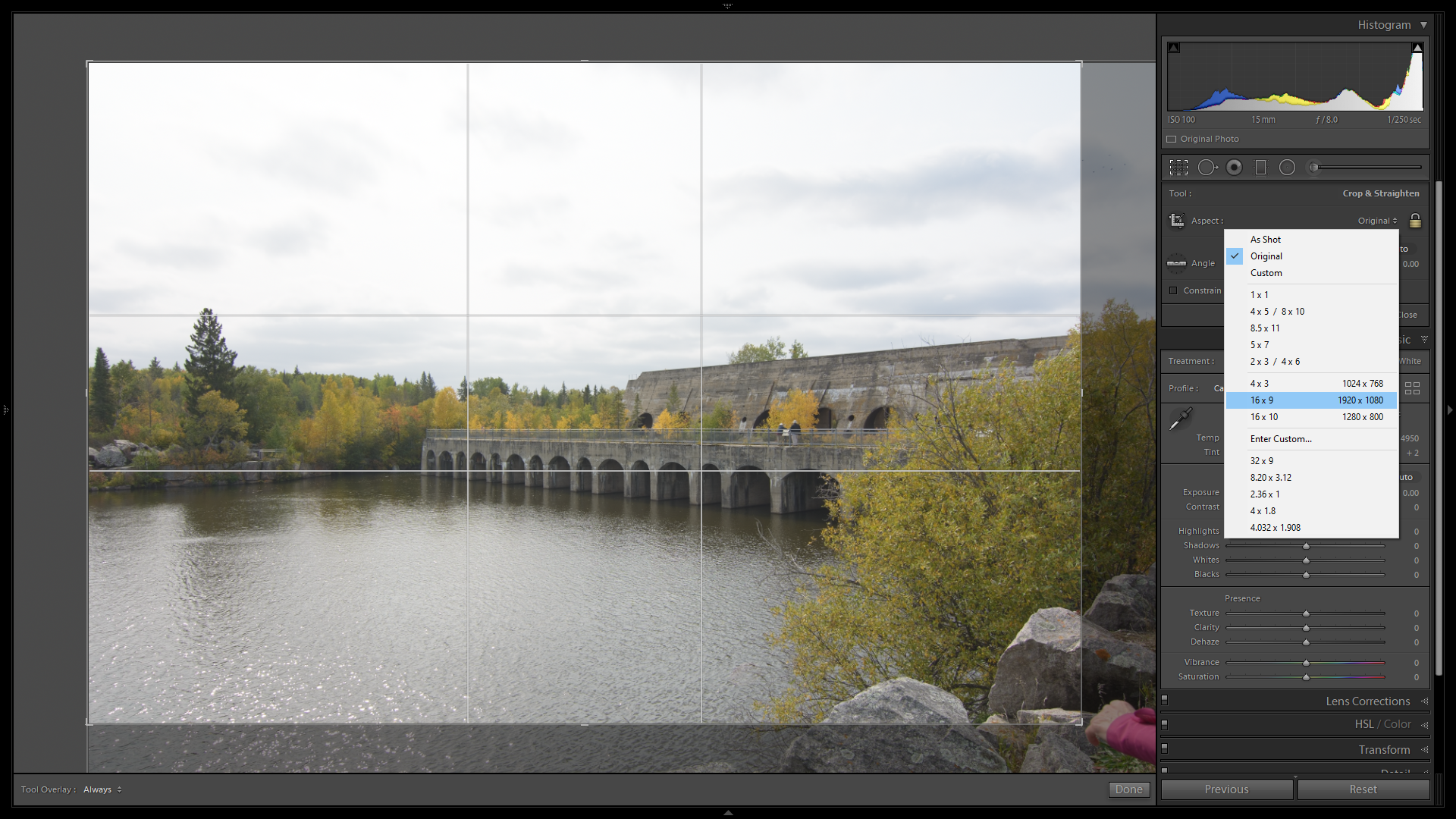
I am not sure if I like the composition of this shot being so stern. Too much bland sky and too much water in the foreground. Since this is a pic for the web, I am free to choose whatever crop ratio I like. If I were to have this printed, I’d need to know the size of the paper to define that exact ratio. It would save me from discarding elements in my picture in the store, where everyone is looking at what I am doing… Here I will be going with a standard 16:9 crop.
A small adjustment to the crop area to reduce a bit of the rocks and the picture looks like this:
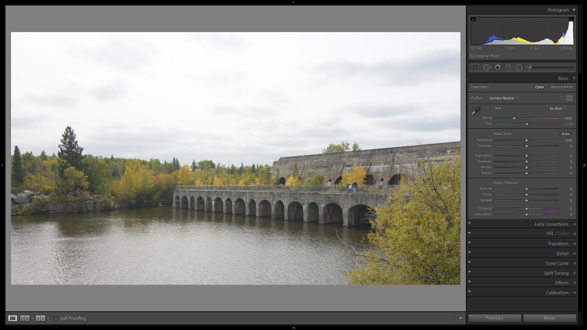 No more rocks, jacket and a lot less water.
The next step is the Auto Tone button. Often enough this gives me a fairly good starting point as to what I would want the picture to look like.
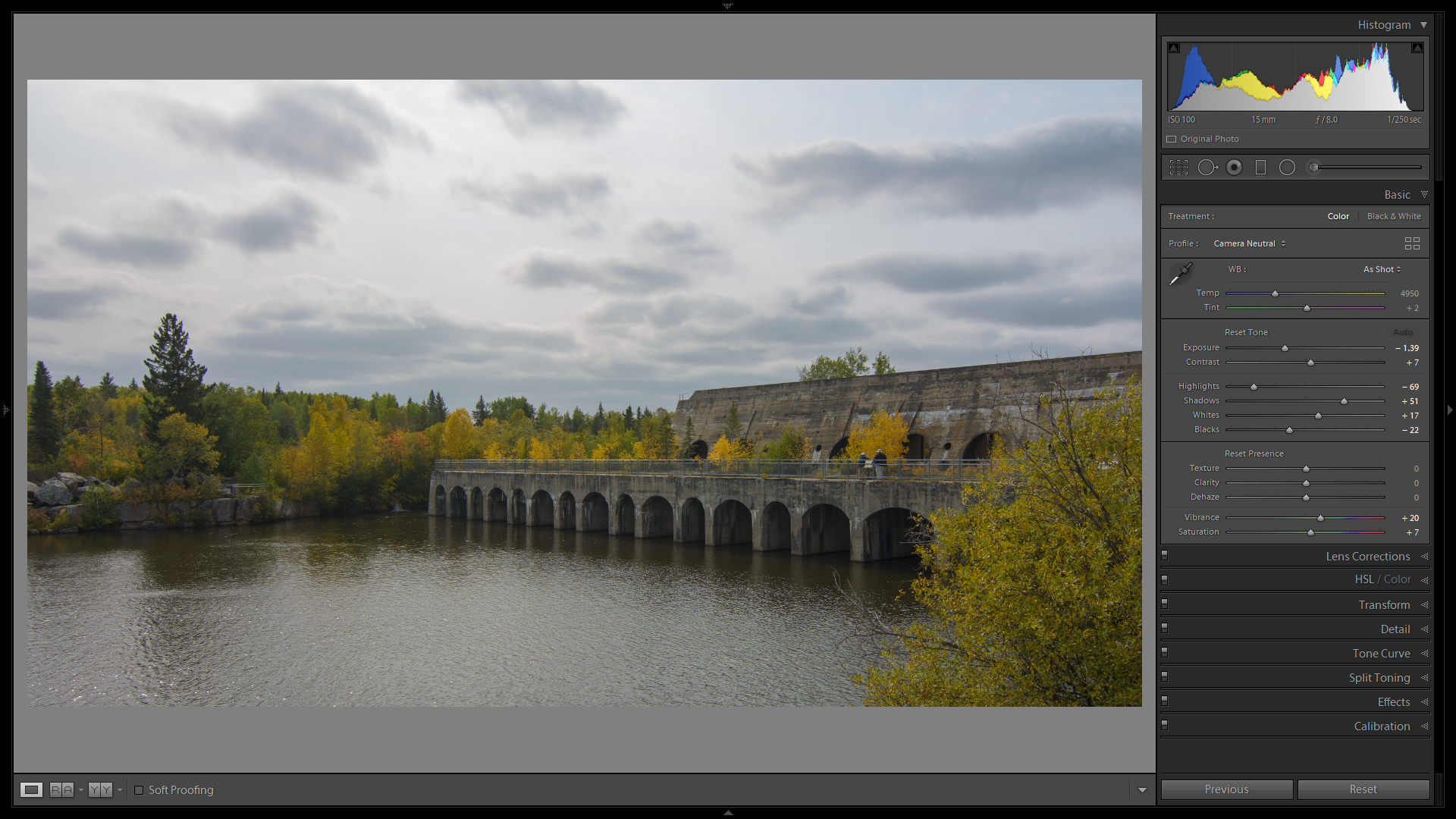
It greatly darkens the picture here. The Histogram shows that both the dark side and the light side of the tones are unused. Yes, I use the histogram sometimes. Now, before I go and mess around with it, A Shift+double-click on the Whites label (not the slider!) and on the Blacks label (also, not the slider!) will try to expand the tonal range of the picture to its optimal. Often it works, sometimes it needs adjustment.
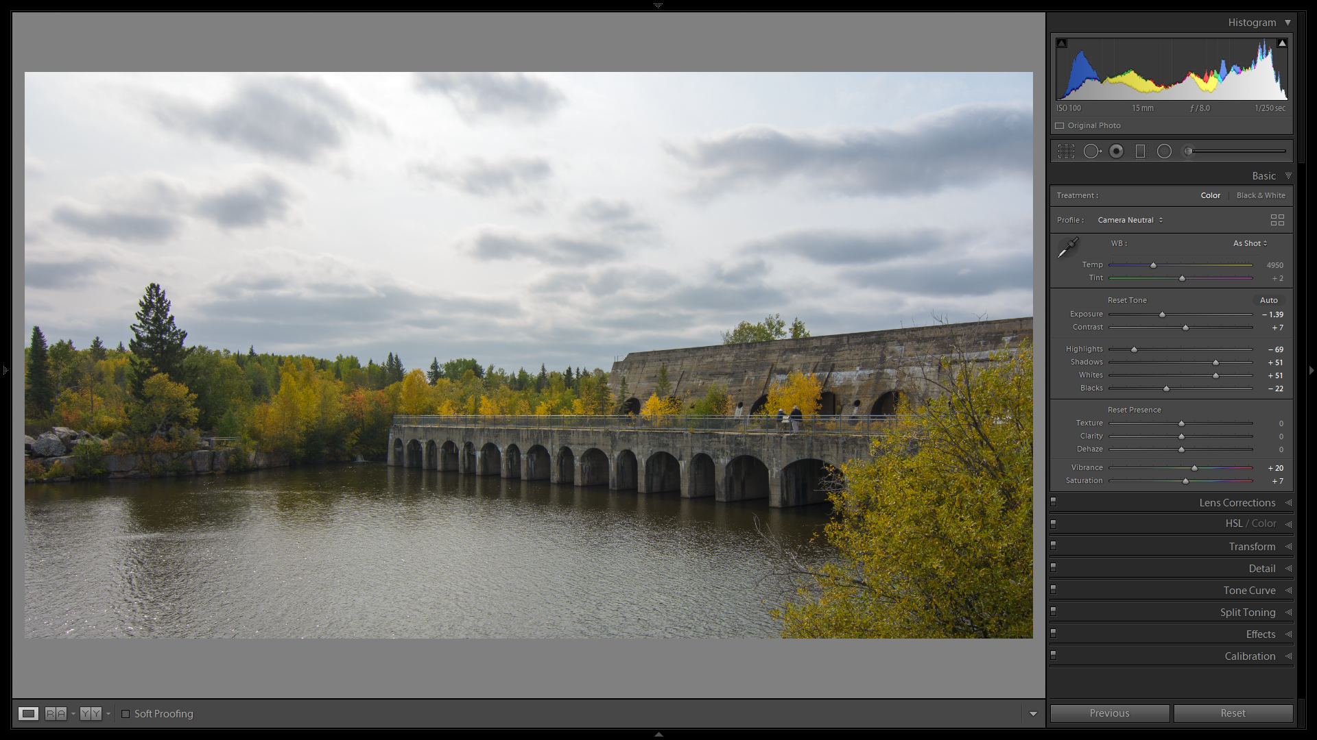
Shift+Double-click on Whites.
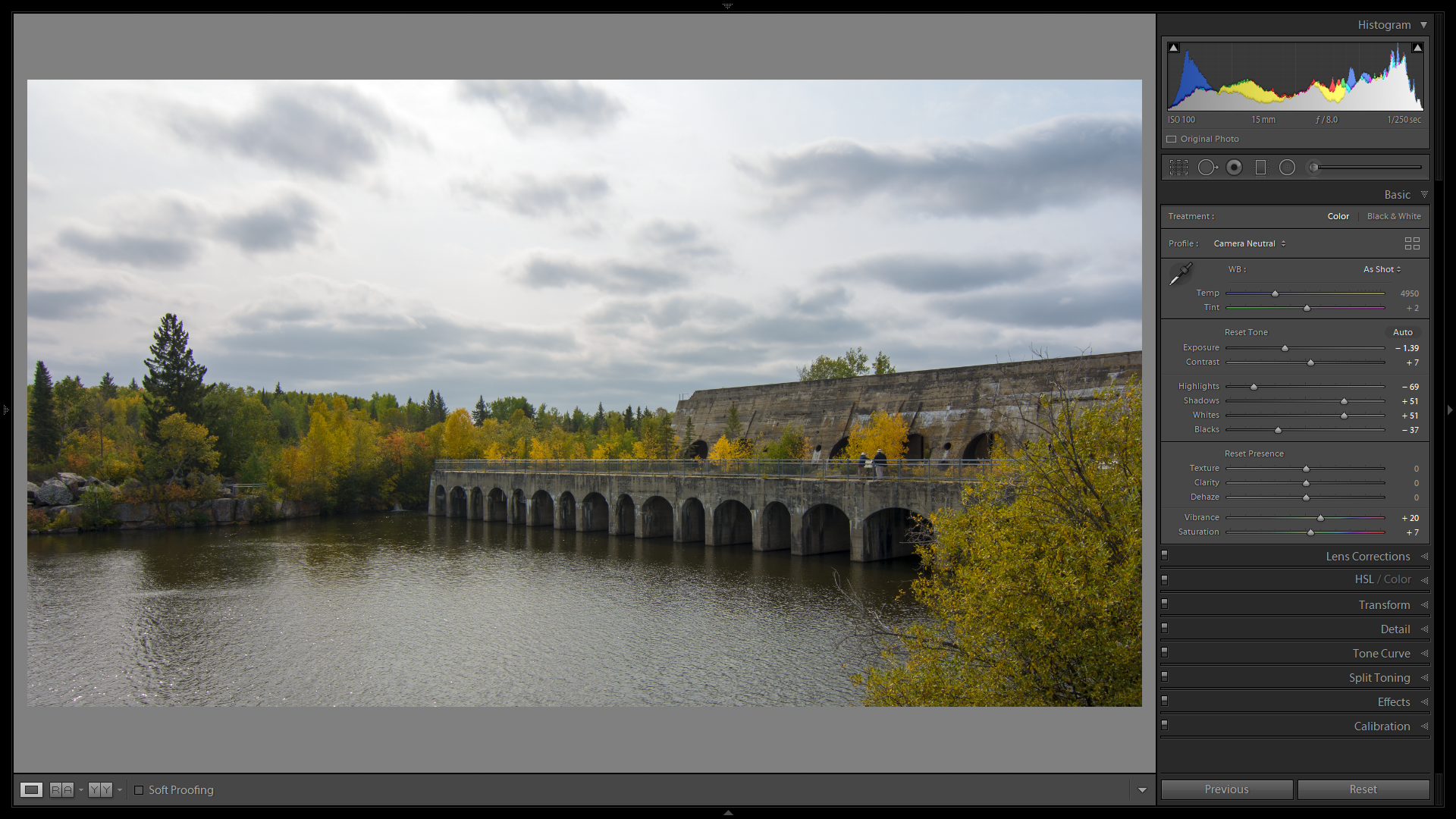
A Shift+Double-click on the Blacks made only a minor change, so all is good. The overall exposure was brought down to –1.39, which leaves me with the centre section of the image a little too dark. Adjusting that Exposure will adjust all of the image, prompting another round of Shift+Double-Clicks on Whites and Blacks. Quick enough to do, but a bit boring.
Instead, I will be using an adjustment brush to clear things up a bit. Press K or click the big horizontal brush just below the histogram.
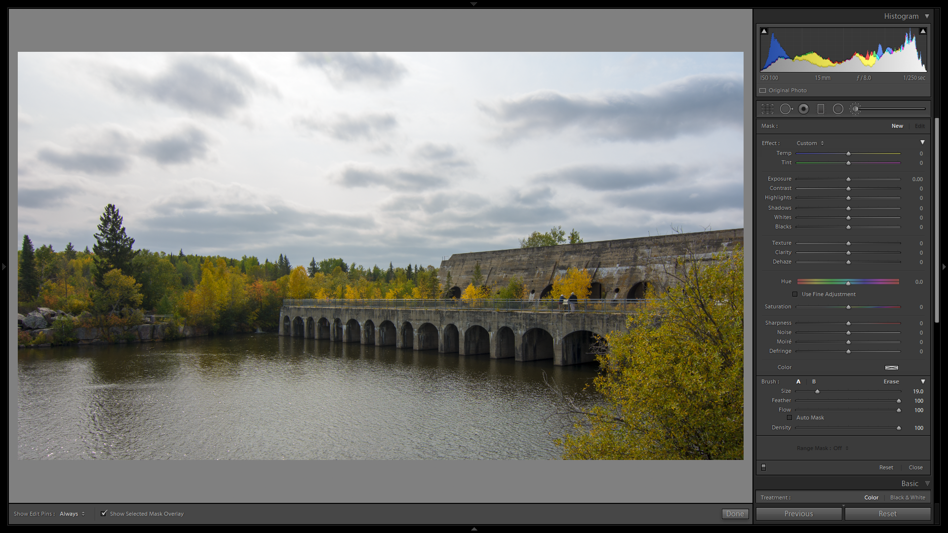
I’ll take a fairly large brush with a large feather. The “Feather” is the falloff between full effect and no effect. A hard brush will have no feather and a hard edge between the effect and no effect.

The red mask overlay will show me where my effect will be applied. It is not part of the image.
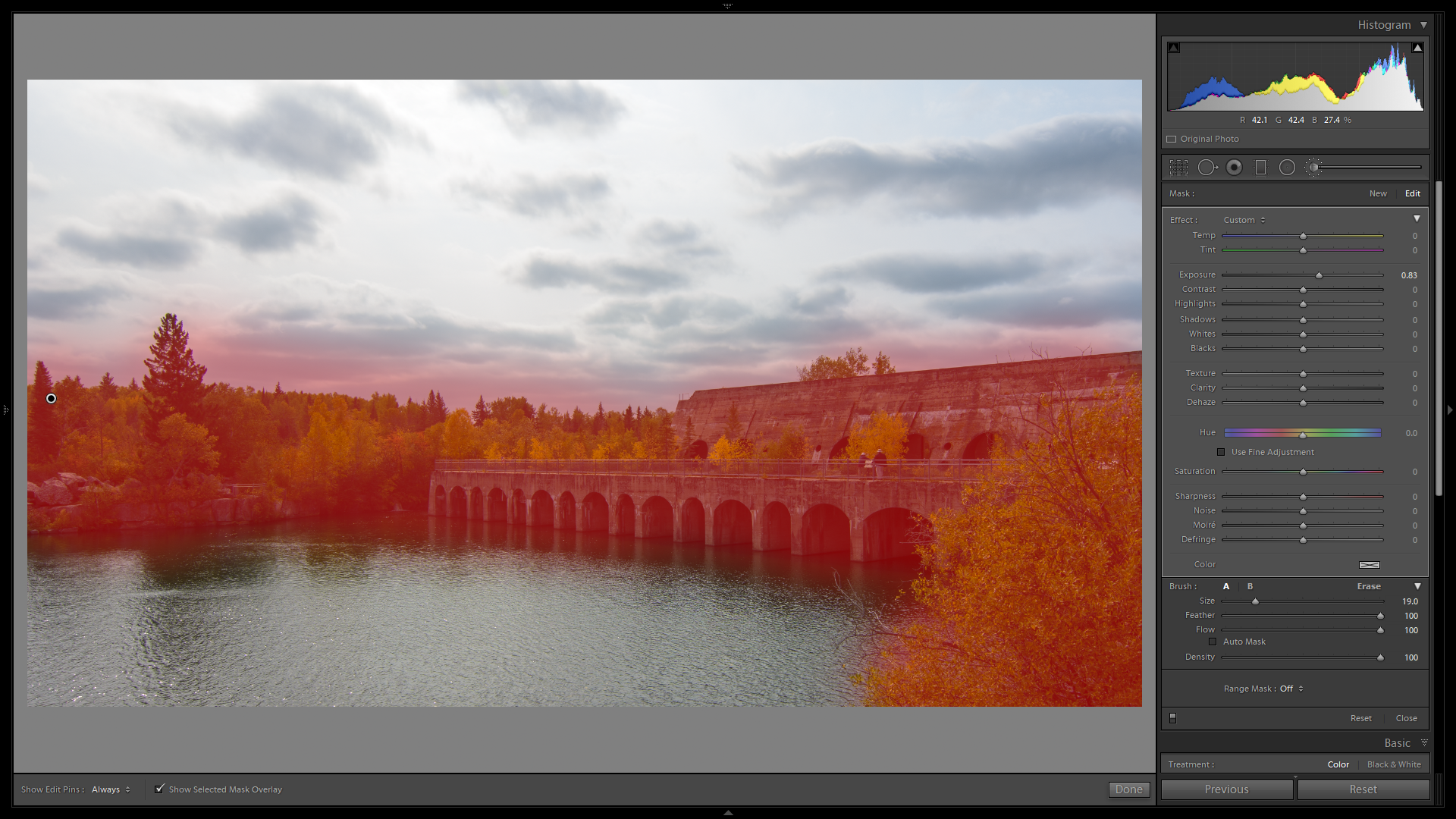
Since the Auto button brought down the complete image’s exposure by 1.39 stops, I’d want to counteract that with a +0.89 (or thereabouts) in the brushed area.
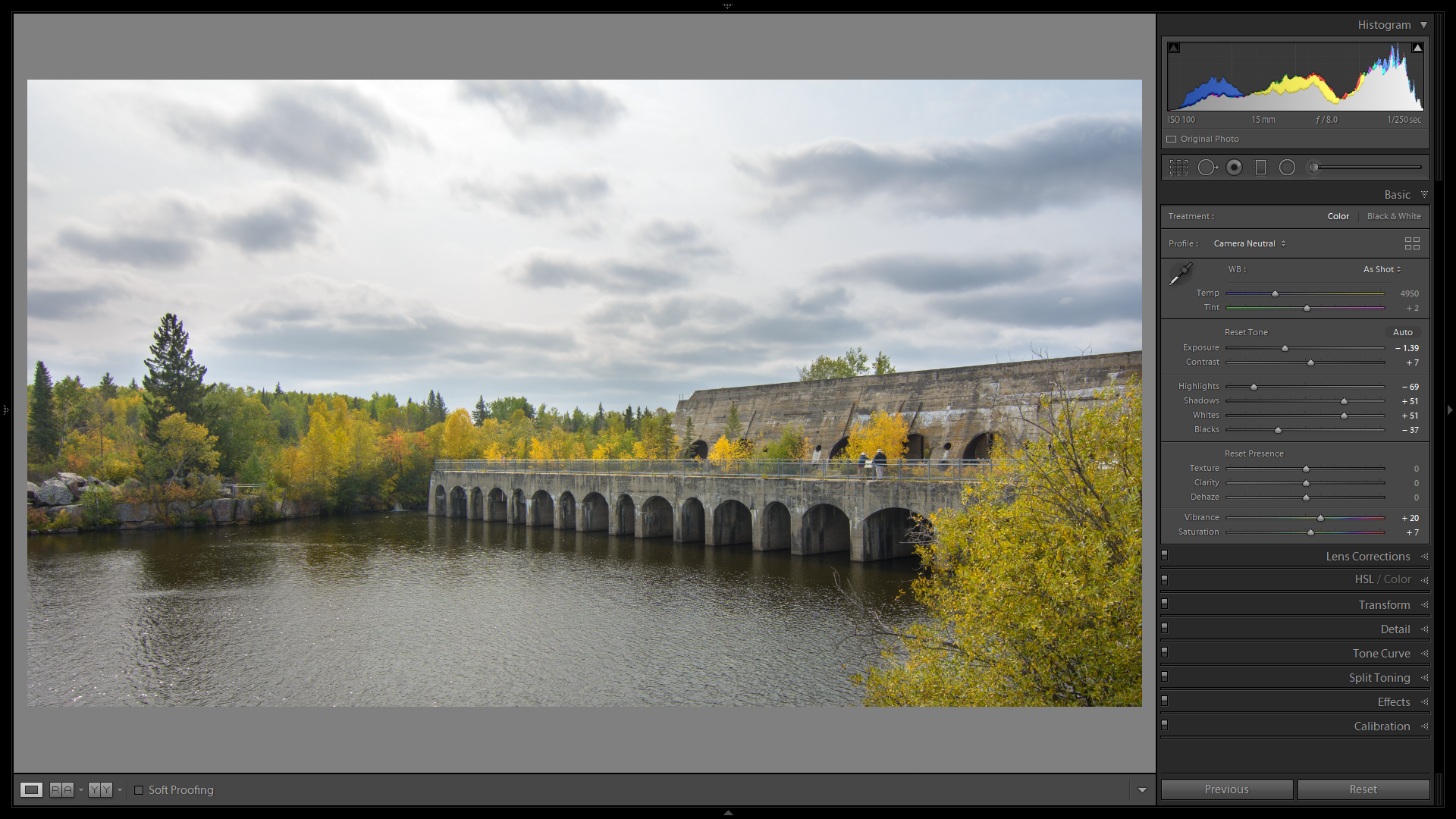
Now, the scene looks more like I saw it when I shot the picture.
This now leaves me with a lot of sky I could crop out, but I’m wondering if I can do something with that sky. There is. The sky has a bit of detail, it was a fairly bland day that day. A bit of Dehaze on the sky would do wonders, but that tree on the left will make my life difficult if it’s included in the dehaze process. A bit like the TV series in the 70s and 80s where the sky was darkened for a drmatic effect, but the tops of the towers and houses were darkened as well. Not something I want todo myself.
So lets start with applying the Gradient filter. Sliding it down with the Shift key pressed allows for a strict horizontal or strict vertical filter.
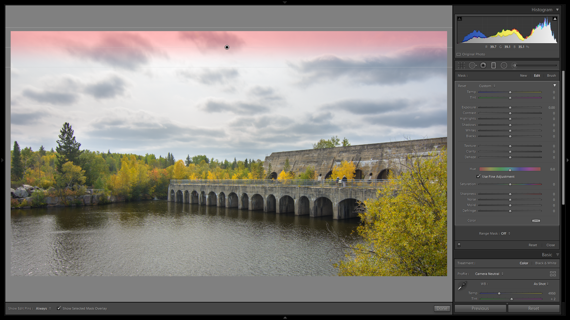
I only need a fairly small gradient, not one to pull down all the way to the trees. That would make a large feather instead. Now that I have the hardness of my gradient defined, I can pull down that pin (black dot) to the treeline.
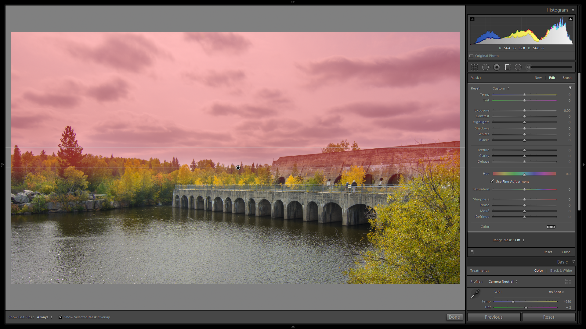
The problem of these TV series now becomes apparent. Leaving the gradient above the large tree would prohibit it from working on the sky just above the horizon. For this specific problem we have the Range Mask in the bottom of the gradient panel. I will select the Color option in there:
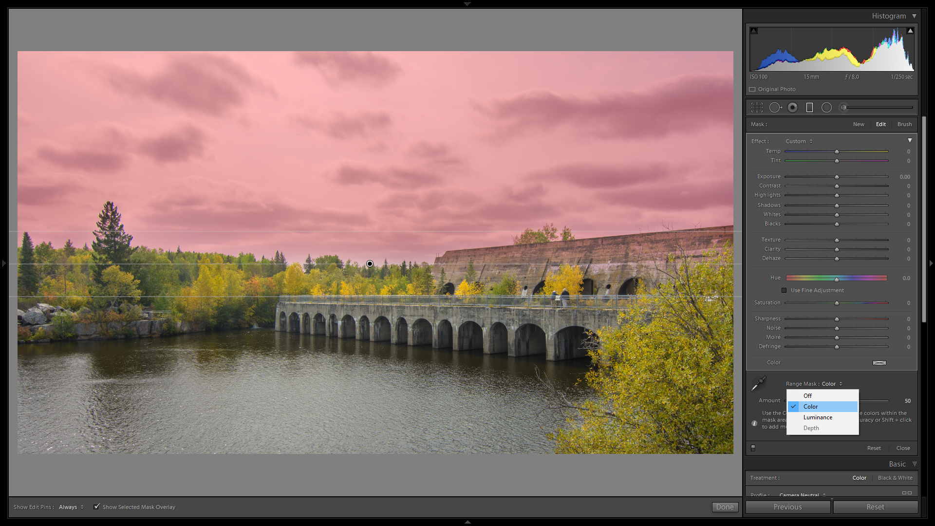
The sliders will now show up to define what Color should be included and what not. The easy way out here now is to use the eyedropper tool.

Take the tool and select a large part of the sky, but not the trees or the dam (for me).
This now DEselects the parts that are NOT inside the selected area.

You can see here that the red mask overlay is no longer on the tree (it wraps around it) and not on the dam. So now we can work on the sky. A bit of Dehaze would do miracles. An amount of 20 will do the trick, in your own images, check the effect before you apply it completely. If the red mask gets in the way, uncheck the Show Selected Mask Overlay at the bottom of the screen.

Click Done when done (obvious).
We now have a way more dramatic sky:
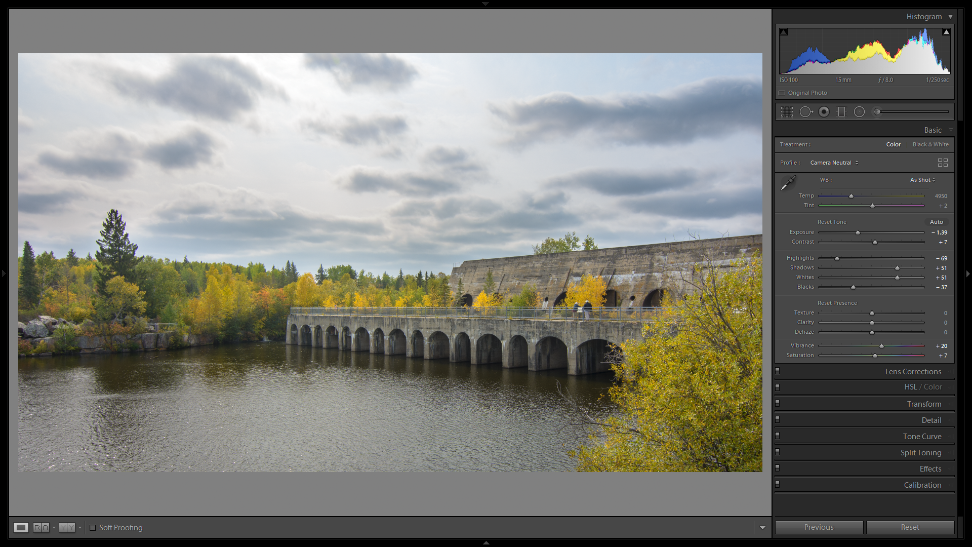
To now make those trees pop a bit more, head over to the HSL panel. In the Luminance tab of this panel, select the eyedropper and click and drag it upward on one of the yellow trees. It may be a bit of trial and error here, but the yellow should start to pop, leaving all other colours alone.
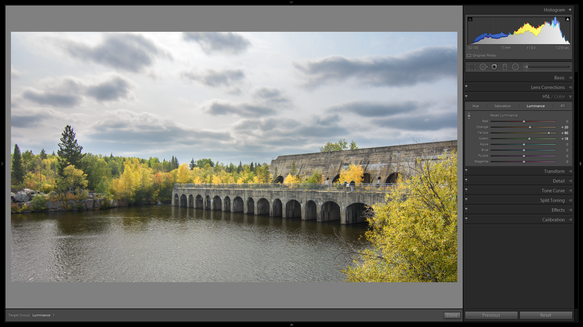
The illusion of a bit of sunshine has now “come to light” ![]()
To compare the before and after shots, have a look at these two:
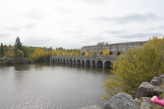 Before | 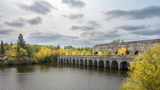 After |
I hope this has given you some insight in what you can do with a picture in Lightroom Classic. As you can see, there is no magic in the settings or in the treatment. The magic will appear in your picture once you are done with it. Just keep in mind to present a fully finished product, never a two part version of “Which would you like better?”. Remember that you are the photographer or artist, not some “ignorant” audience…
