For a long time I have been lazy. Lazy with my landscape photos. While stating that “If I need more than 30 seconds to make the image look good, it’s trash” might be an idea, some images still deserve a little extra to show up nicely.

Let’s start with the final result of a very simple image.
The final image of this post is the first one, don’t worry we’ll get back to it.
A few weeks ago I was in a park during a morning of heavy hoarfrost. I snapped a picture of a lone, standing tree and thought no more of it. When I got home, the picture looked like this:

This is the image as imported from the camera, no development applied.
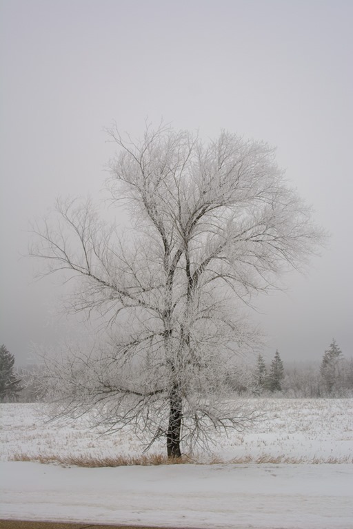
As usual, I applied the Auto button for a good start,
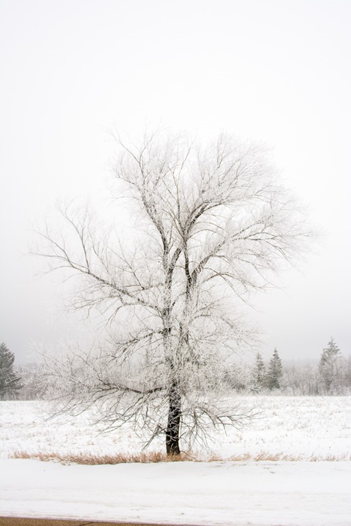
then shift double click on Blacks

And shift double click on Whites to define the optimal white point of the picture.
To be honest, the picture didn’t inspire me and it remained in the Lightroom Library, discarded, but just a little too good to be deleted permanently. I often keep these pictures in case a new version of Lightroom, or a new plugin or other program comes along and can do what I had in mind.
A few weeks later, I thought about the Tone Curve. I blogged about that Tone Curve about 10 years ago when it was first introduced in Lightroom 3. The download link is (obviously) no longer valid there, but the rest of the post is.
More or less.
So I started off again with my basic import like this:
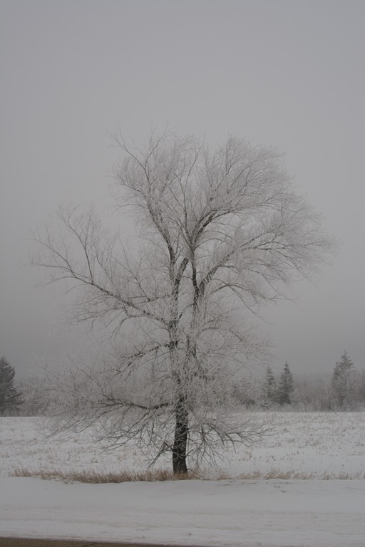
Don’t try to find differences, this is the same picture as above ![]() . No settings applied.
. No settings applied.
Then I started playing a bit with the Tone Curve. I selected the Point Curve in the Tone Curve panel as this is the most flexible and most dangerous type of curve. My previous post about this shows what can go wrong if you overdo it.
First, I deformed the point curve from the regular straight (neutral, do-nothing) line into an “S” curve:
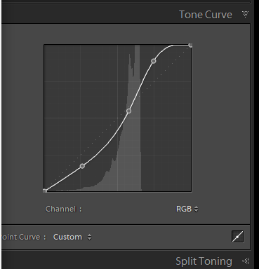 Note that the “S” is kind of irregular, not a basic shape.
The picture now looked like this:
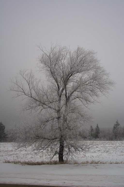
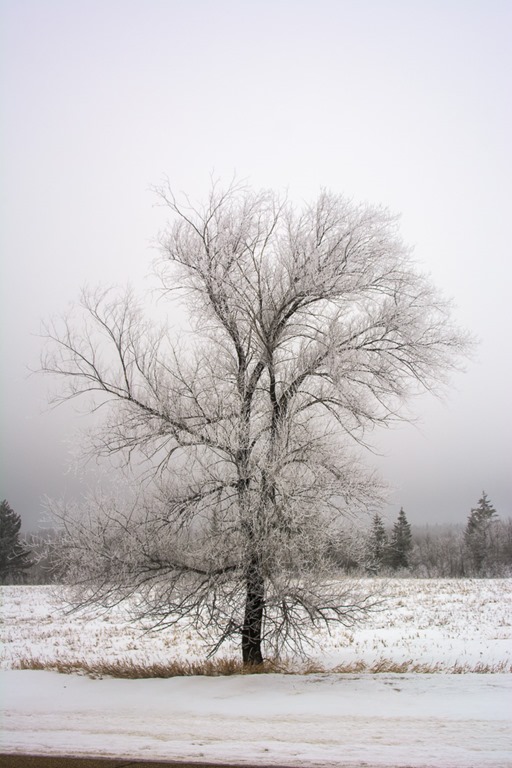
Still a bit dark, but already with a lot more “pop”. Since I am still lazy, I then applied my regular Auto button and came up with this:
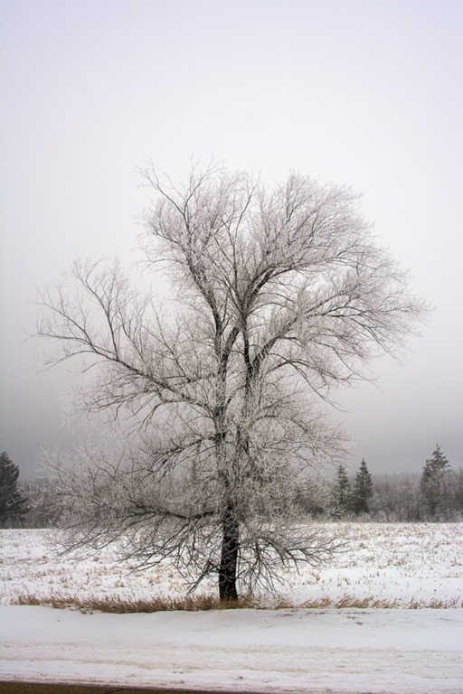
Still not happy I added the Black point using Shift+DoubleClick on the Blacks in the basic panel
And then again the same for the whites.

Just to show that the image result from my Basic treatment and the Extra treatment with the Tone curve makes a nice difference, here are the two side by side:
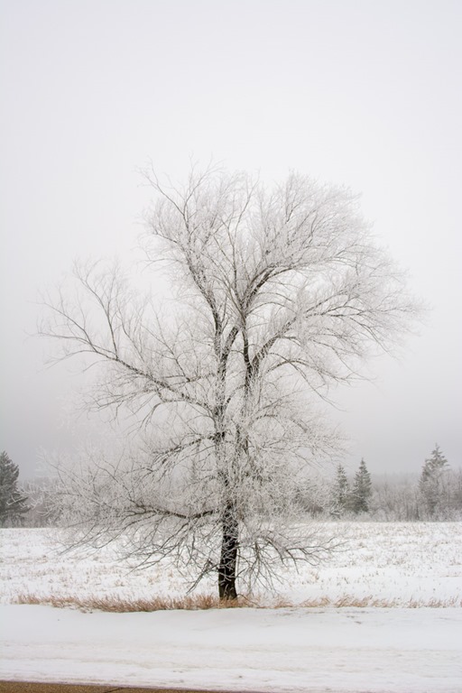
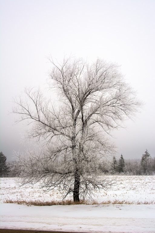
Left, Auto+Blacks+Whites, right Tone Curve+Auto+Blacks+Whites
As you can see, there is quite the difference between the two. I can hear you argue that these pictures are mostly Black and White pictures, I agree. But just imagine what you can do with this same Tone Curve on a near (but not quite) perfect image of a different nature?
Try out that Tone Curve, but remember one thing, if nothing else, “a little is already a lot!” in the tone curve. It’s very easy to overdo it and ruin a (near) perfectly good picture.
