It has been a while since I wrote the first two parts. Mainly because things happen, like “life”. So, to get back to my workflow, and to complete the series, what is left to be done to my pictures before they go out into the world? Until now, I have culled and re-culled them, leaving only the workable pictures. I have added keywords to them so that I will be able to find them again one day. I have geotagged them, so that I know where they were taken. What’s next?
Well, here comes the fun part of the workflow. Mainly this is why everybody buys some form of Photoshop or Lightroom. This is the part where images get their looks. On purpose I will post screenshots instead of real pictures. Simply to show what the screen looks like.
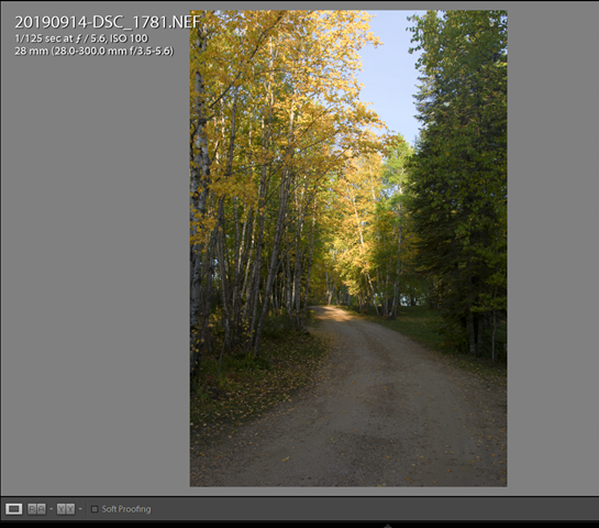
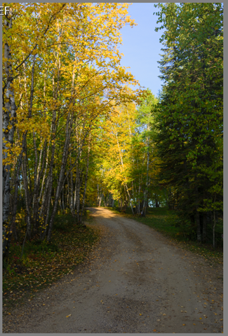
A shot of a fall road in Manitoba, in case you’re interested. This is straight out of the camera and can use a little TLC before it is ready to face the world. I always shoot with one camera profile: Camera Neutral (or also called Camera Flat). This retains the most details, but looks flat and little appetising. The picture needs work.
The first panel in Development is where the fun starts.
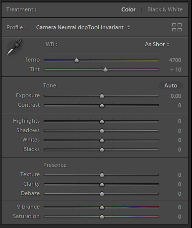 Everything is still at neutral here, no sliders have been moved. This particular picture can do with a profile called Camera Landscape, a profile made to enhance natural colours. Once applied, the picture has a lot more contrast and has better colour in the greens and yellows.
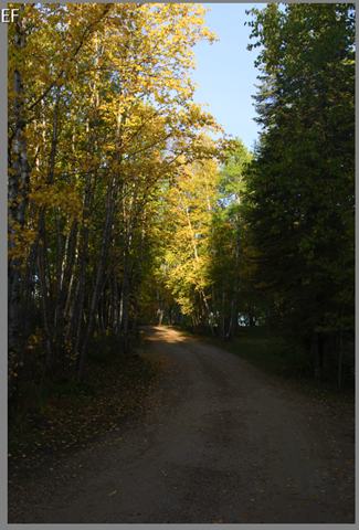 Except that the shadows are now way underexposed. Knowing that we do have that data (look at the original) we can tweak that. My first click now is the “Auto” button. Already I can hear the multitudes screaming that “Auto” is an amateur move
 ![]() . Adobe has spent years and years to perfect the behaviour of this button, so I can hardly qualify it as “Amateur”. However, I use it only as a starting point. If I like it, it stays, otherwise it goes.
. Adobe has spent years and years to perfect the behaviour of this button, so I can hardly qualify it as “Amateur”. However, I use it only as a starting point. If I like it, it stays, otherwise it goes.
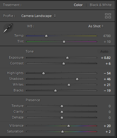 The Auto button has improved my picture quite a bit. It moved all my sliders at once, choosing the “best” position for each of them. My picture now looks like this:
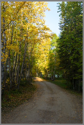 Clearly an improvement. However, this is not the end. Upon closer inspection, the top branches of the trees seem to have some purple fringing and perhaps I can squeeze some more tonal range out of this picture. To squeeze the maximum out of your picture, you can do it by hand or by a Shift+DoubleClick. I prefer the fast method of Shift+DoubleClick. Both on the Whites and Blacks sliders. Shift+DoubleClick on the words (not the sliders!) “Blacks” and “Whites” and they may move a little more in the best direction.
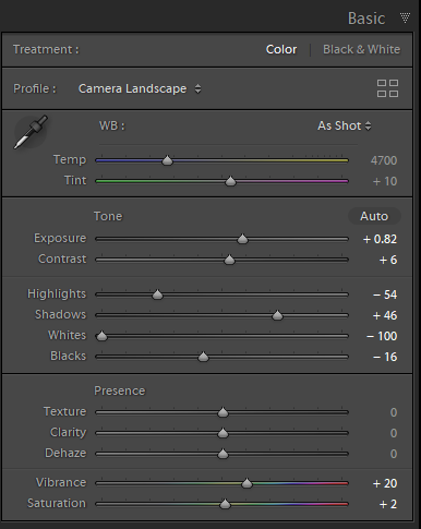 The whites seemed to have been way too much when I clicked the Auto button. They have now been reduced to –100. Blacks have moved only very slightly from –19 to –16. The picture now looks like this:
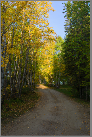 The blue sky is now way better visible, not so washed out. The last step is to make sure the purple fringing is gone.
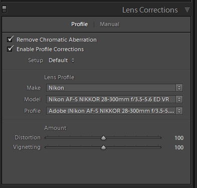 By checking both “Remove chromatic aberration” and “Enable Profile corrections” Lightroom now knows what to do for the best correction of the fringing and a few other optical corrections proper to the lens that I used. Some lens distortion issues will now have been corrected as well. Cheaper lenses as well as expensive lenses will have distortions in some manner and Lightroom is capable of eliminating them.
 And that ends 90% of my development of pictures. Had I been shooting a wedding, the work on some pictures might have been more involved. This is, however, most of what I do in Lightroom for the basic pictures. If I have to spend more than a few minutes on a picture to make it look good, then I will have missed the shot. That’s just my way of looking at this.
Other shots, that will have been taken in very different conditions may need more work.
As far as workflow goes, that’s it. Any picture that needs more work will get it, up to a certain point where I decide it’s not worth it. By then the picture will be marked for deletion and will be gone the next time I cull pictures.
